
50 maps that explain how America lives, spends, and believes


Even though rural and small-town life are still an important part of the American tradition, the population is overwhelmingly urban and suburban, with about 80% of US residents living in a metropolitan area made up of one or more big cities and their surrounding suburban zones.
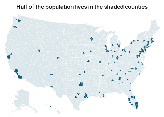
Big cities, especially those along the coasts, have an outsized share of the US population. According to the Census Bureau's population estimates, in 2018, the 10 largest metropolitan areas together had about 87 million residents, or about a quarter of the total population.

Four of the 10 counties with the biggest percent increases in population between 2017 and 2018 were in Texas, and another three were in Florida.
Read more: Here are the fastest growing and shrinking counties in America

The growth of Southern urban and suburban counties is even more apparent on this map. Places in Florida and Texas dominate the list of the 10 counties with the biggest population increases from domestic migration.
Read more: A lot of Americans are moving South — and many are heading to Florida
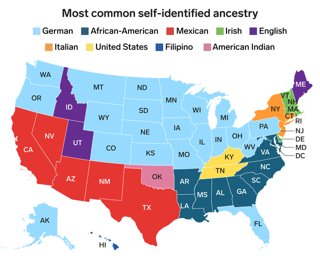
The Census Bureau's annual American Community Survey asks respondents to list up to two nationalities for their family's ancestry. Using individual-level results assembled by the Minnesota Population Center's Integrated Public Use Microdata Series (IPUMS) program, we found the most common self-identified ancestry in each state.
The labels for the ancestry groups shown in the map are those used by IPUMS, and are intended to best categorize how survey respondents described themselves.
A plurality of survey respondents in two states, Kentucky and Tennessee, listed their ancestry simply as "United States," suggesting that they view their roots as more tightly connected to this country than to some far-off region from the distant past.
Read more: The most common ancestry in every US state

The top map shows the most commonly spoken language in every state other than English and Spanish, again based on IPUMS data from the 2017 American Community Survey. There's a huge variety in the language communities shown, and it reflects the diversity of where people come from.
English is, unsurprisingly, the most commonly spoken language across the US, and Spanish is second-most common in 46 states and the District of Columbia. So, we excluded those two languages in the above map.
Read more: This map shows the most commonly spoken language in every US state, excluding English and Spanish
The lower map shows the overall share of people who spoke any language other than English at home. That share is much higher in states along the Southern border with Mexico and in big urban states like Illinois, New York, and New Jersey, which all host large populations of immigrants.
Read more: Here's how many people in each state speak a language other than English at home

California, Nevada, Texas, Florida, and the urban northeast loom large. All these states have historically been magnets for immigrants and people looking to work and settle in the US.
Read more: Here's how many people in each state were born outside the US

Mexico was the most common country of origin for foreign-born residents in 32 states, and so we excluded it from the map above.
As in the earlier maps showing ancestries and languages, there's a wide variety of countries represented on the map above, reflecting the global origins of American immigrants.
Read more: This map shows where each state's largest immigrant group comes from, excluding Mexico

The dark blue counties saw a large increase in population from net international migration, or the difference between immigrants from another country and emigrants out of the US.
Southern Florida's counties saw a large influx of population from abroad, as did most of Massachusetts.
Read more: There are fewer immigrants moving to the US. This map shows where they're headed.
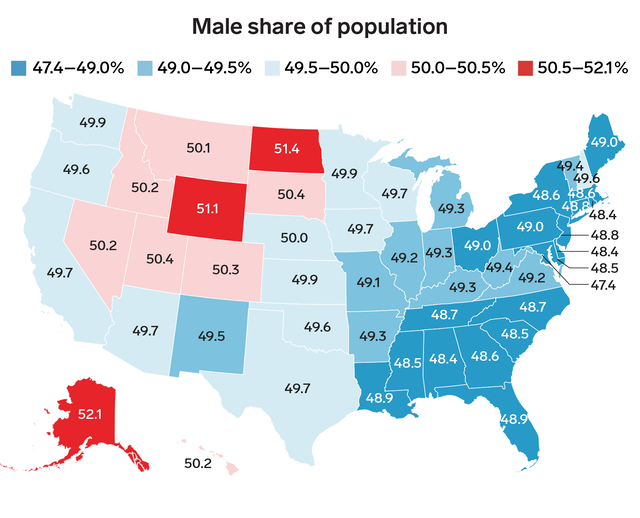
North Dakota, Wyoming, and Alaska all had particularly high ratios of male residents to female residents in 2017, the latest year for which information was available.
One possible factor could be the predominance of male-dominated industries like oil extraction and mining in those states.
Read more: There are only 10 states in the US with more men than women

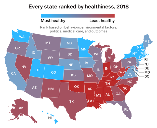
The study looked at environmental and behavioral factors, including air pollution, smoking and obesity rates, and how many people have health insurance.
Read more: The 50 US states ranked from most to least healthy

The high and rising cost of healthcare in the US is a perennial political issue. Most of the Democratic presidential candidates have put forward plans to address costs through increased government coverage.
The candidates are roughly split into two camps, with several, including former Texas congressman Beto O'Rourke, favoring some form of a "public option" for uninsured Americans to be able to buy in to federal insurance programs like Medicare and Medicaid. Meanwhile, the more left-leaning candidates like Vermont Senator Bernie Sanders have proposed a "Medicare for All" plan that would largely end private insurance in favor of a federal single-payer system.

As part of its program tracking population increases and decreases across the country, the Census Bureau counts "natural population change," or the net difference between births and deaths in a location.
Counties with the highest population-adjusted rates of net births over deaths were scattered across the US, while three of the 10 counties with the highest rates of deaths over births were in Florida.
Read more: Here are the US counties where more people are dying than being born

States like Utah, Alaska, and Arizona had an average of more than two children per family, while families in states like Maine and Vermont had fewer than 1.8 children per family on average.

The first map shows estimates of how many people in each state identify as LGBT, based on an analysis of polling data from Gallup. The second map shows the share of same-sex couples raising children.
Intriguingly, states with smaller self-identified LGBT populations largely tend to have a higher share of same-sex families raising children.

In 2018, Ava and William were popular names in much of the South, while Emma and Liam were the most common names for girls and boys, respectively, in a wide swath of the country.
Read more: The most popular baby names in every state

By this measure, educational attainment is highest in Colorado, Massachusetts, and Washington, DC, all of which have at least 40% of their population with a bachelor's degree or higher.

A Business Insider analysis of data from the Department of Education looked at the average six-year completion rate for first-time, full-time students at four-year colleges and universities based in each state.
Massachusetts' colleges had the highest average graduation rate, with 73.5% of students seeking a four-year degree finishing within six years.
Arizona had the lowest rate, with just 26.3% of students finishing on time. However, the mostly online University of Phoenix is included in Arizona's Department of Education data. Excluding that school, the state's average graduation rate improved to a much higher 50.9%.
Read more: The 15 US states with the lowest college graduation rates
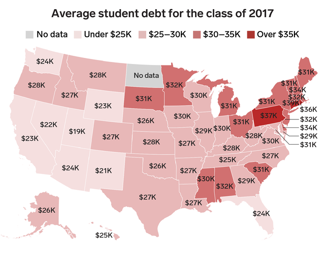
Also like healthcare, student debt has become an emerging issue in the 2020 presidential election. Both Senator Elizabeth Warren and Senator Bernie Sanders have published proposals to cancel Americans' student debt burdens and dramatically reduce the cost of college for new students.

The two main sets of divorce property rules are "community property," which treats all assets held by a married couple as being held jointly, and thus split evenly in the event of a divorce.
"Equitable distribution" keeps spouses' individual holdings separate, leaving assets to be divided at a judge's discretion in the case of a divorce.


The Pew Research Center's 2014 Religious Landscape Survey analyzed religious beliefs and habits of Americans. The above map shows the share of each state's population that Pew identified as being "highly religious" based on four measures of religious behavior: attending weekly services, praying daily, believing in God with absolute certainty, and saying that religion was important in their lives.
New England had a relatively low share of "highly religious" respondents in Pew's survey, with about a third of the populations of Maine, Vermont, New Hampshire, and Massachusetts self-identifying with the above devout behaviors.
Meanwhile, over three quarters of Southern states like Missouri and Alabama were highly religious, by Pew's definition.

Although Republican red visually dominates the map on the right showing the results of the 2018 midterm congressional elections, Democrats largely swept denser urban and suburban districts across the country, securing a solid majority in the House.
The Senate, however, remained in Republican hands, as it has since the 2014 elections.
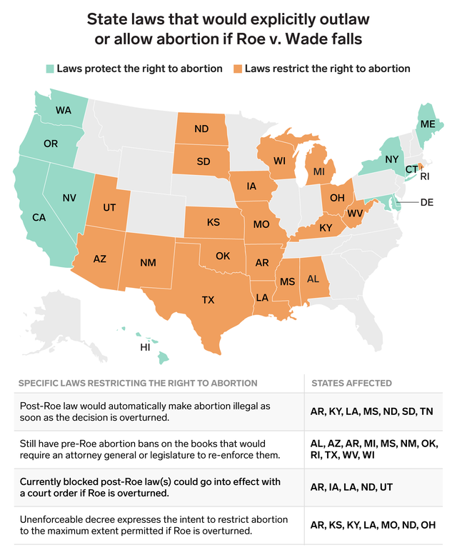
Several conservative-leaning states have passed laws that would dramatically restrict the right to an abortion should Roe be overturned. A number of more liberal states have passed laws explicitly protecting abortion rights in preparation for such an event.
Aside from laws that would take effect in the event of Roe v. Wade being overturned, several states have recently passed more severe restrictions on the procedure, including Georgia's controversial "heartbeat bill" and a law in Alabama making abortion a felony, with no exceptions for rape or incest.

Business Insider's Michelle Mark reported that refugees "are generally placed in cities where they either have relatives, or an existing community of immigrants from their home countries." The above map shows where refugees were settled in the 2018 fiscal year.
A Pew Research Center analysis found that over half of refugees were settled in just 10 states in 2016.

A 2018 Business Insider analysis identified the number of Immigration and Customs Enforcement detention centers in every state. There were at least two such facilities in all 50 states and DC, with Texas counting 184 detention centers in operation.
Conditions in ICE detention centers have been a controversial issue since last year, as the administration ramped up a policy of separating children of migrants from their parents. In recent days, stories of children being denied access to basic needs like soap, bedding, and toothbrushes have reignited the furor over the detainment facilities.
Read more: Here's how many ICE detention centers are holding immigrants in every state
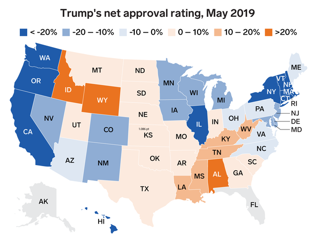
Polling firm Morning Consult tracks Trump's monthly approval rating in each US state. In the map above, states in blue have a net negative approval rating (that is, more residents disapproving of Trump than approving), while states in orange have a net positive rating.
As of May 2019, Trump's net approval is negative in several of the key swing states that helped his surprise 2016 election victory, including Pennsylvania, Michigan, and Wisconsin.

In November 2018, Florida overwhelmingly passed a referendum restoring voting rights to felons who have served their time, overturning a particularly stringent ban that blocked 1.5 million residents from voting due to a prior felony conviction.
However, two days before this map was published, the Sunshine State's governor undercut that historic amendment by signing a bill limiting how many felons will be able to vote.
Several of the Democratic candidates for the 2020 presidential election have called for loosening or lifting restrictions on felon voting. Senator Elizabeth Warren proposed allowing felons to vote once they've completed their sentences; Senator Bernie Sanders went further, suggesting that currently incarcerated felons should also be allowed to participate in elections.
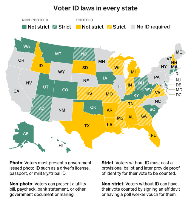
Supporters of the laws argue that they are needed to prevent voter fraud, although there is little evidence that such fraud is widespread in the US. Critics of the laws point out that they tend to disproportionately affect poor and minority voters.
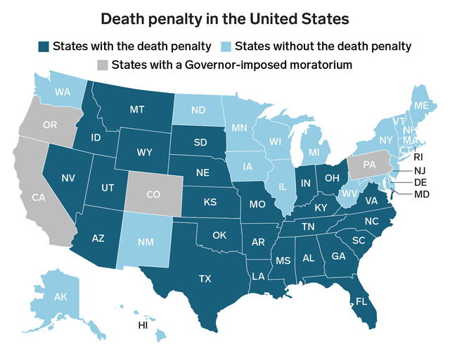
In March, California governor Gavin Newsom declared a moratorium on capital punishment in the country's largest state. In May, New Hampshire repealed its death penalty.
Read more: Here are the states that still have the power to execute prisoners

Marijuana legalization has become increasingly popular with the overall public. A report from Vox pointed out that in three major public opinion surveys, respondents favored legalization by a roughly two-to-one margin.
Illinois governor J.B. Pritzker just signed a law legalizing marijuana in that state that is scheduled to take effect on January 1, 2020.


Median wages tend to be higher in more urban and coastal states, and lower in rural states, reflecting the overall economic fortunes of those regions.

Many of the states with extremely low shares of workers at or below the federal minimum have set more generous state minimum wages at a higher level, like California and Washington, making work at $7.25 per hour virtually nonexistent.
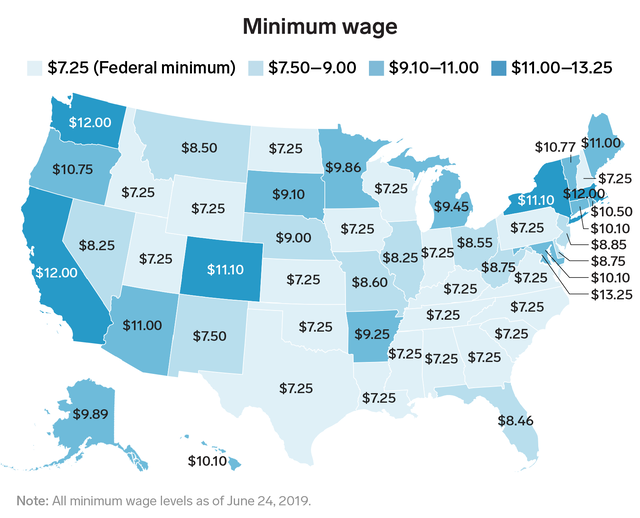
The Economic Policy Institute's Minimum Wage Tracker monitors the minimum wage across states and cities. According to the EPI, several states and Washington, DC, are set to see increases in the minimum wage throughout 2019, with some increases taking effect on July 1.

The "Fight for $15" movement, largely made up of fast-food and other food-service workers, has been pushing for higher minimum wages and increased pay and better working conditions. The labor-backed movement, which began in 2012, has called for cities, states, and the federal government to raise minimum wages to $15 per hour.

Doctors tend to be extremely well payed, and various medical professions are the highest-payed job in most states, according to the Bureau of Labor Statistics' Occupational Employment Statistics program. The above map excludes those medical professions.
Read more: This map shows the highest-paying job in every state, excluding doctors
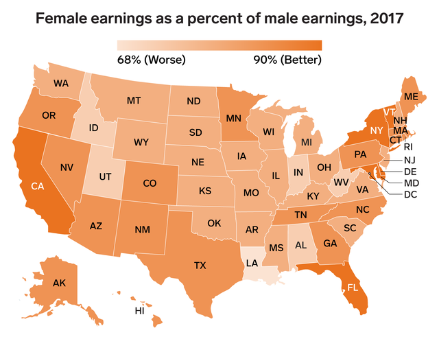
The gender wage gap is widest in Louisiana, where the median full-time, year-round female worker earns 68.8% of what her male counterpart earns.
The gap is narrowest in California and Washington, DC, where the typical woman earns 89.1% of what the typical man makes.
Read more: 6 charts that show the glaring gap between men and women's salaries

The above map shows the percent difference in total personal income between the median full-time, year-round worker in the baby boomer generation (born between 1946 and 1964, per the Pew Research Center) and in the millennial generation (born between 1981 and 1996).
In each state and DC, the typical boomer earned more than the typical millennial. The gap was narrowest in Iowa and Nebraska, where boomers earned just 25% more than millennials. It was widest in Alaska, where the typical boomer made 65% more than the typical millennial.
Read more: Here's how much more the typical baby boomer makes than the typical millennial in every US state

Median earnings for workers with at least a bachelor's degree are higher than earnings for those without a degree in every state and DC.
The median college-grad earns at least twice as much as the median non-grad in New Jersey, New York, California, and Washington, DC.

The unemployment rate was below 3% in 12 states as of April 2019, according to the Bureau of Labor Statistics. Some states still have relatively high unemployment rates, with Alaska topping the list at 6.5%.
That's a big change from the darkest days of the Great Recession, when state unemployment rates regularly topped 10%. Millions of jobs were lost in the years around the 2008 financial crisis, which saw a near-implosion of the global financial system in the wake of a collapse in the US housing market.
While the recession officially lasted from December 2007 through June 2009, the labor market only slowly recovered from the crash over the last decade.

The Bureau of Labor Statistics' annual Census of Fatal Occupational Injuries tracks workplace fatalities across the country.
Alaska had the highest fatal injury rate, with 10.2 workplace deaths per 100,000 full-time workers.


The map shows the largest publicly traded corporation by revenue with its headquarters in every state, according to the Fortune 1000 list.
Read more: The biggest company in almost every US state
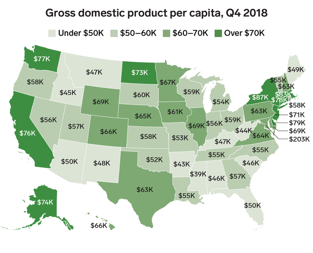
GDP per capita has a wide range across the country, from about $39,000 in Mississippi to a far higher $87,000 in New York — and a whopping $203,000 in Washington, DC.

The Bureau of Economic Analysis publishes an annual measure of the relative cost of living across the US. In 2017, the San Jose metro area in California was about 31% more expensive than the national average.
New York City's metro area was about 22% more expensive than average.
Read more: The 15 most expensive cities in America

The median homeowner with a mortgage in New Jersey pays nearly two and a half times as much for their monthly housing costs as a similar homeowner in West Virginia.
Read more: Here's exactly how much it typically costs to own a home in every US state

The median renter in Hawaii spends $1,573 on housing each month, more than double the $690 a median renter in West Virginia pays.

The National Low Income Housing Coalition publishes regular reports on the wage needed to afford a two-bedroom apartment in each state. Affordability here means paying no more than 30% of one's income, so the NLIHC takes the fair-market rent for a two-bedroom apartment and calculates the needed hourly wage for that rent to be 30% of that wage.
As seen elsewhere, more urbanized states are more expensive, and so the wage needed to afford an apartment is higher. Notably, that wage is higher than the minimum wage in each state and DC.

In January 2019, the number of people staying overnight at homeless shelters in New York City hit a record high of nearly 64,000 people, according to the Coalition for the Homeless.
Read more: How the homeless population in every state has changed over the past 10 years

The amount spent per capita on gas is a combination of both gas prices and the amount people drive. Even though gas is relatively expensive in DC and moderately priced in New York, robust public transportation systems in the capital and New York City reduce the number of miles driven in those locales.
Read more: Here's how much the average person spends on gas in every state

Many of the states with higher per capita tax revenues fall in the traditionally liberal and urban Northeast and West Coast.
Not all the tax revenue listed above comes from individual taxpayers or businesses. Some resources-heavy states, like North Dakota, had very high revenues from severance taxes levied on oil, gas, and other resources that are shipped out of state.

The drafters of the Declaration of Independence made sure to list fundamental rights as those of "life, liberty, and the pursuit of happiness." Since then, working hard to attain the good life has become a cornerstone of the American Dream.
The above map shows how Americans in each state rate their own happiness, as measured by a Gallup-Sharecare index of overall well-being.
The index is based on five indicators of a happy, healthy, secure life: a sense of purpose, a supportive social network, financial security, feeling safe and happy in one's community, and being in generally good health.
By Gallup's measure, states like Louisiana and West Virginia were struggling, with the lowest average scores on the well-being index. But on the happier end of the scale, South Dakota was the state with the highest overall average well-being, followed by Vermont.
 Next Story
 I spent $2,000 for 7 nights in a 179-square-foot room on one of the world's largest cruise ships. Take a look inside my cabin.
 Saudi Arabia wants China to help fund its struggling $500 billion Neom megaproject. Investors may not be too excited.
 One of the world's only 5-star airlines seems to be considering asking business-class passengers to bring their own cutlery
 From terrace to table: 8 Edible plants you can grow in your home
 India fourth largest military spender globally in 2023: SIPRI report
 New study forecasts high chance of record-breaking heat and humidity in India in the coming months
 Gold plunges ₹1,450 to ₹72,200, silver prices dive by ₹2,300
 Strong domestic demand supporting India's growth: Morgan Stanley
