Here are 7 of the top chart patterns used by technical analysts to buy stocks
Matthew Fox

- Technical analysts believe that stock prices often trade in patterns, as the motivating driver behind the movement of stocks is humans, and humans exhibit the same emotions when it comes to their money: fear and greed.
- These two predictable emotions help create predictable trading patterns that technical analysts try to capitalize on.
- Here are seven of the top bullish patterns that technical analysts use to buy stocks.
- Visit Business Insider's homepage for more stories.
One of the biggest drivers of stock prices is human emotions, particularly fear and greed.
Investors typically exhibit predictable emotions when a stock price moves up and down, and these emotions can lead to trading activity that creates predictable charting patterns.
Technical analysts attempt to take the emotion out of investing by solely relying on the patterns found within charts to trade stocks, potentially giving them an edge over investors who are susceptible to to making trade decisions driven by fear and greed.
While these patterns can be predictable, they aren't bullet-proof. Head fakes, bull traps, and failed breakdowns occur often and tend to shake traders out of their positions right before the big move.
That's why discipline is so important in technical analysis.
Having a plan before entering a position can help traders weather choppy price movements, increasing their chances of riding an uptrend and avoiding a downtrend.
A plan before entering a trade includes defining a "stop loss" level where if the stock falls to a certain price point, you automatically sell, take a small loss, and move on to the next trading opportunity.
A plan would also include a price objective where the trader would look to unload some if not all of the position to take profits.
Here are seven of the top bullish chart patterns that technical analysts use to buy stocks.
Read the original article on Business Insider1. Double Bottom
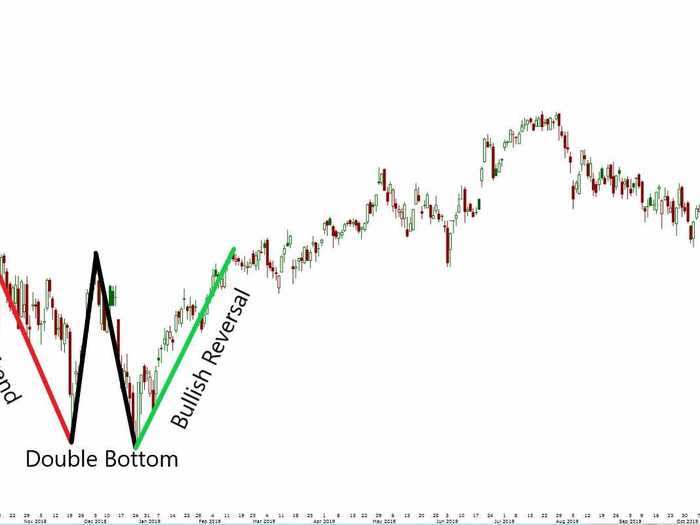
A double bottom is a bullish reversal pattern that describes the fall, then rebound, then fall, and then second rebound of a stock.
A successful double bottom pattern looks like a W.
The pattern typically marks the end of a downtrend, and the beginning of an uptrend.
It's generally accepted that the first and second bottom should be within a couple percent near each other, if not at the same level.
A double bottom typically takes two to three months to form, and the farther apart the two bottoms, the more likely the pattern will be successful.
2. Ascending Triangle
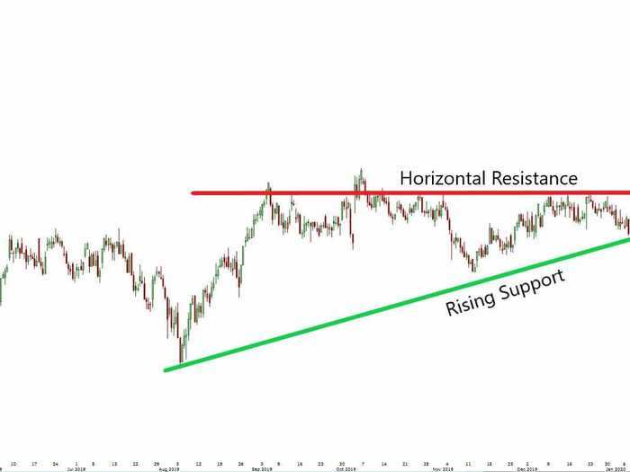
An ascending triangle is a bullish continuation pattern and one of three triangle patterns used in technical analysis.
The trading setup is usually found in an uptrend, formed when a stock makes higher lows, and meets resistance at the same price level.
Rising support and horizontal resistance ultimately converge at the breakout level.
This pattern creates a well-defined setup for traders. If the stock breaks above horizontal resistance, traders will buy the stock, and set a stop loss order usually just below the prior resistance level.
But if the stock breaks below the rising support level, a short trade signal would be generated.
An ascending triangle is a high probability setup if the breakout occurs on high volume, and is more reliable than a symmetrical triangle pattern.
3. Cup and Handle
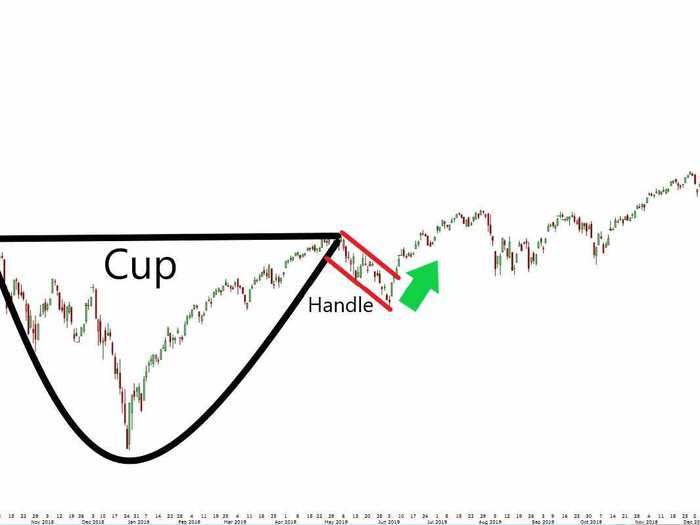
A cup and handle is a bullish pattern that resembles a cup, formed by a basing pattern that typically looks like a "U," followed by a handle that is formed by a short-term down trend.
Once a stock breaks out above the handle, a technical analyst would buy the stock.
A trader could generate a measured move price target by measuring the depth of the cup in price, and add that amount to the lid of the cup.
This pattern usually extends an uptrend that is already in place.
A U-shaped cup is a higher probability set up than a V-shaped cup, but both can work.
4. Bull Flag
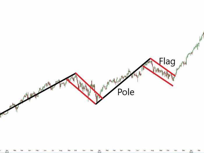
A bullish flag pattern occurs when a stock is in a strong uptrend, and resembles a flag with two main components: the pole and the flag.
This pattern is a bullish continuation pattern. Typically traders would buy the stock after it breaks above the short-term downtrend, or flag.
A measured-move price target can be obtained by measuring the distance of the pole, and adding it to the top right corner of the flag.
Bullish flags are short-term patterns that ideally last one to four weeks, typically don't last longer than eight weeks, and usually follow an sharp uptrend.
5. Bull Pennant
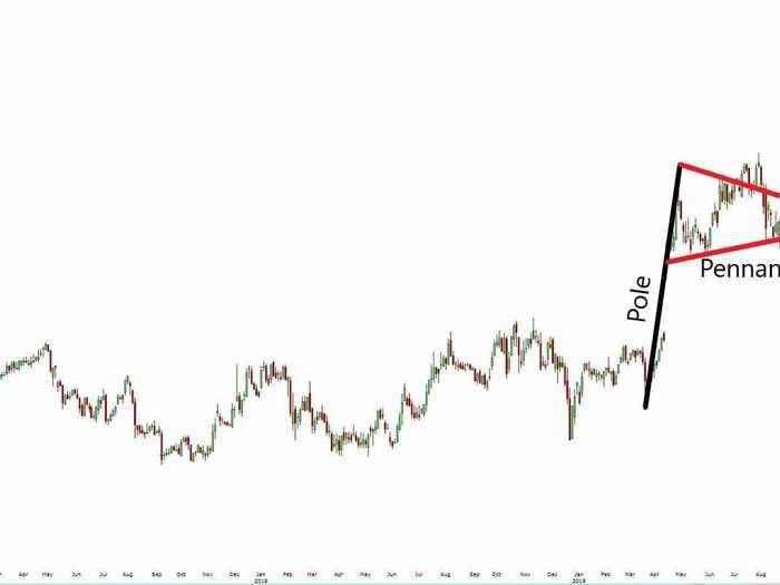
Similar to a bull flag, a bullish pennant is a continuation pattern that consists of a pole and a symmetrical triangle, usually following an uptrend in price.
Rather than a period of sideways consolidation in the shape of a rectangle, price consolidates in the shape of a symmetrical triangle, making a series of higher lows and lower highs.
The uptrend in the security will likely continue on if the stock breaks out above the pennant.
In the chart example above, an example of a failed breakdown, or a bear trap is shown.
At first, the security breaks below the pennant, signaling a breakdown and potentially lower prices ahead.
But then, it quickly recovers, breaks above the pennant, and the uptrend continues.
A measured move target can be obtained by measuring the distance of the pole and adding it to the apex of the pennant triangle.
6. Bullish Engulfing Candle
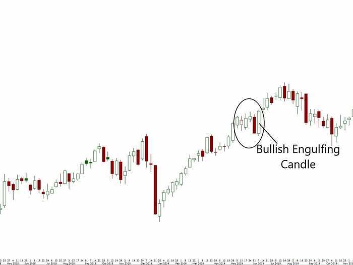
A candlestick is a charting style that shows a security's opening price, closing price, intraday high, and intraday low.
The "body" is represented by the opening and closing price of a stock, and the "tails" are represented by the intraday high and low.
A bullish engulfing candlestick occurs when the body of one trading session completely engulfs the previous session.
This happens when the day's open is lower than the previous day, and its close is higher than the previous day.
When the body of a candle stick "engulfs" prior trading sessions, it signals that bulls are starting to take control from the bears, and a reversal in trend is probable.
The more trading sessions that are engulfed by a single candlestick, the stronger the signal.
In the chart above, the bullish engulfing candlestick engulfs the previous five trading sessions, signifying the likelihood that stocks are on track to move higher.
7. Inverse Head & Shoulders
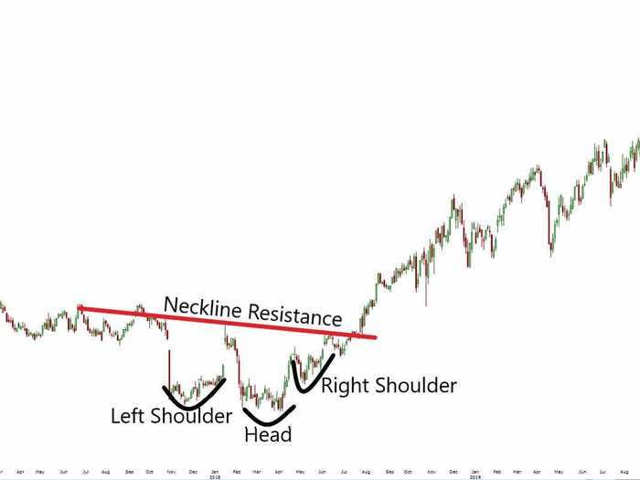
An inverse head-and-shoulders pattern is a bottoming pattern that often signals a reversal in a stock following a bearish trend.
The inverse head and shoulders is related to the bearish head-and-shoulders pattern, which is a topping pattern.
The pattern takes its shape from a series of three bottoms, with the second bottom being the deepest.
A neckline represents resistance and is formed by connecting the three recovery peaks associated with the three bottoms.
When the stock breaks above its neckline, that triggers a buy signal for traders, with a stop loss level being set near the neckline breakout level.
A measured move price target can be obtained by measuring the distance from the head to the neckline, and adding that to the neckline breakout level.
A right shoulder that is higher than the left shoulder is a good sign that an inverse head-and-shoulders pattern will result in a clear breakout and reversal in trend.
READ MORE ARTICLES ON
Popular Right Now
Advertisement