The weird original logos of Apple, Amazon, and other tech giants
Apple

Sony

The font Sony currently uses for their logo is sleek, giving off the same impression as some of their products. The logo they used in 1958, however, eschewed the idea of timelessness in an attempt to seem futuristic.
Amazon
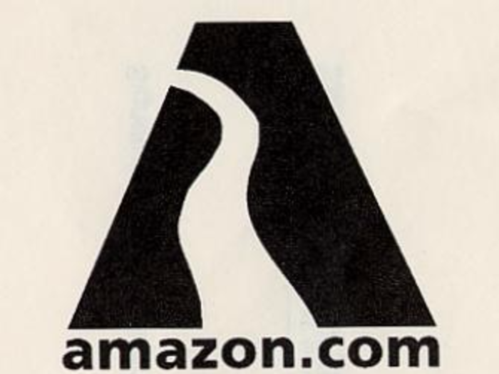
Amazon's original logo lacks the subtlety of its current "A to Z" design. Instead, it's a road leading into an A. This image lasted until 2,000, but it's strange that Amazon's logo didn't depict its main product at the time, books. That stands in contrast with...
Best Buy
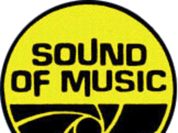
Best Buy launched in 1966 under the name "Sound of Music". The logo resembles more of a CD than record, but at least the logo matched the product.
Xerox
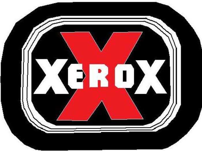
Xerox may have had a fall from grace in the public eye, but no one should forget that it was their PARC division that invented the graphical user interface. Their original logo, however, gives off a slightly different context than it did in the 1950s.
Nintendo (1950)
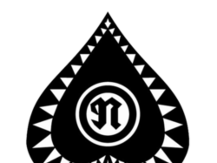
Nintendo was in the games space nearly a century before its world-famous "Mario" games came along. Although the company has soared in popularity over the past three decades, it had its humble start as a card company. This logo, used from 1950 until 1960 illustrates that.
Logitech

Many of the logos here are a brand's first attempt. This was Logitech's third, and while it's the first iteration of their current logo, its seemingly free-form design hasn't stood the test of time.
Microsoft
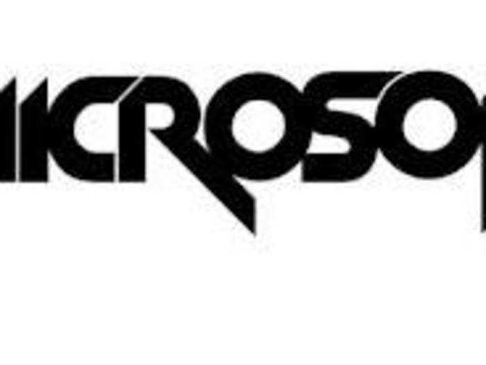
Like Logitech, Microsoft's original logo was pretty solid. The one they used from 1980 through 1982 looks like a company trying to be edgy and cool, just a sign of the times.
Wikipedia
Wikipedia recently turned 15, and its site has stayed largely the same in its overall design, but that's not the case with its logo. The site that has given billions of people a chance to contribute to arguably the most organized set of information on the web didn't have much of a logo at its start in 2001.
BONUS: Delta Airlines
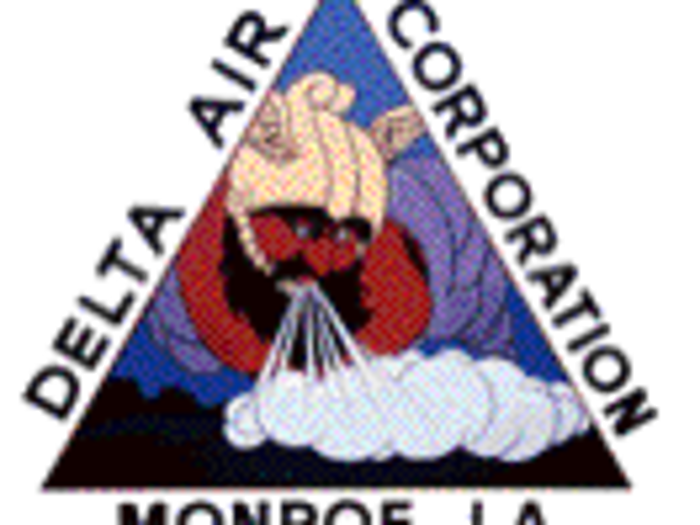
While its not strictly a tech company, Delta's original logo is quite something. The well-known airline used this logo during its first year of operations in 1928.
Popular Right Now
Advertisement