2022 in graphics and visual storytelling

In 2022 Insider's graphics team covered everything from the Russia-Ukraine War and the overturning of Roe v. Wade to the warehouse boom across the US and our government becoming the oldest in history. We built scrolly maps and network webs, incorporated animations into our stories, and built custom multimedia experiences for our biggest stories.
Our team of developers and designers created dozens of graphics and experiences this year, but these are our favorite projects.
The oldest government in history
Design and development by Annie Fu, Shayanne Gal, Taylor Tyson and Skye Gould
How Joe Biden's views have changed on 5 key issues during his 50 years in politics
Design and development by Taylor Tyson and Shayanne Gal
The $3 billion quest to build a flying car
Design and development by Kazi Awal
We created a guide to the world of micro influencer managers
Design and development by Taylor Tyson and Shayanne Gal
We're tracking the most important experiments that could turn psychedelics like LSD and ecstasy into approved medicines
Design and development by Shayanne Gal, Annie Fu, and Alex Ford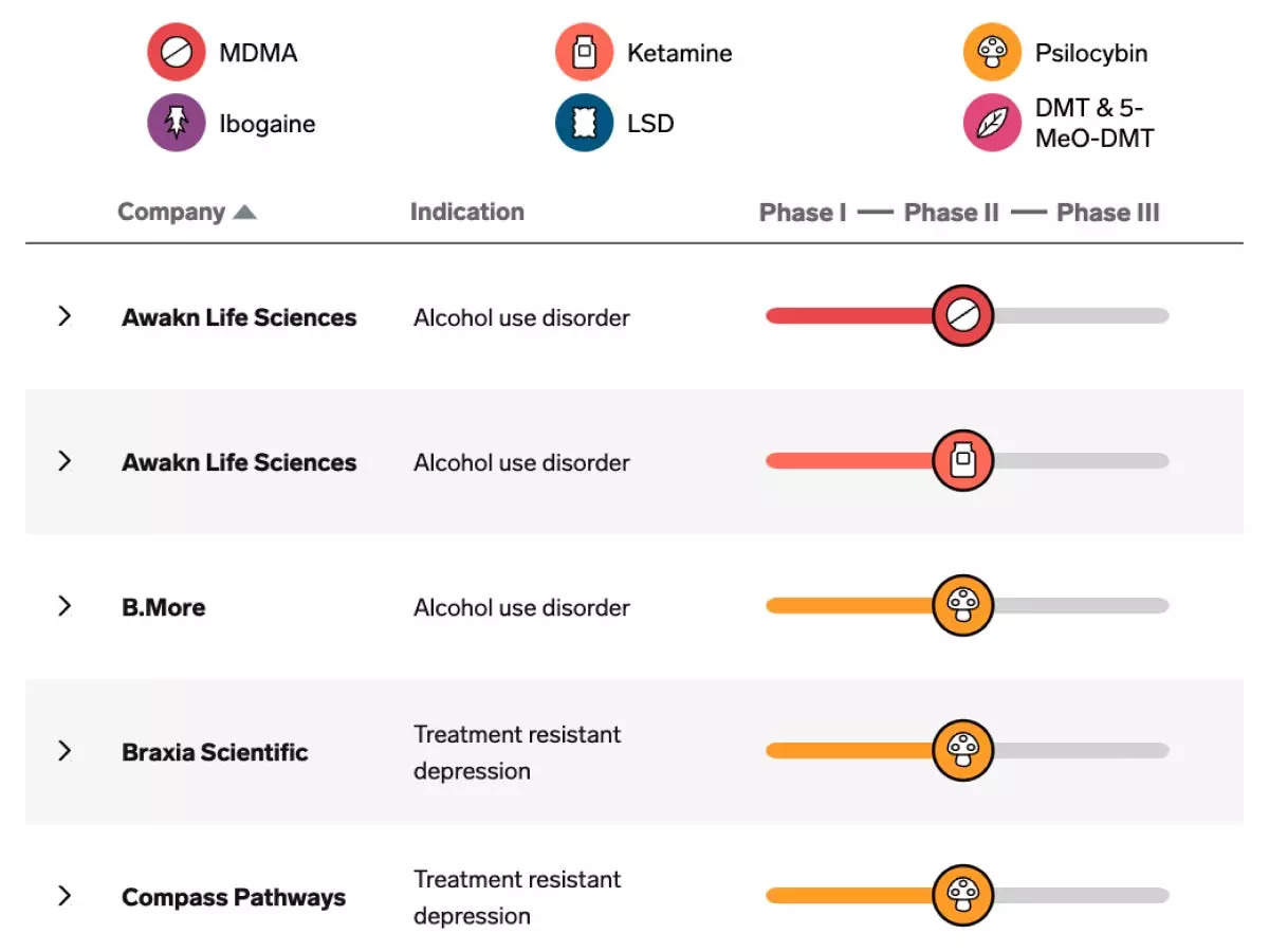
The Columbus, Ohio Warehouse Boom
Design and development by Annie Fu
Behind the project:
Making the scrollytelling map with the appending warehouse dots over time was a fun, but tricky technical task. I had to make sure the timer started only when reaching that slide and account for the user scrolling forward too quickly or backward while the timer was still running.
It was a great exercise in building interaction and animation within a single scrolly layer.
- Annie Fu, Associate Data Graphics DeveloperHow artificial intelligence is being used to create a whole new kind of online fakery
Design and development by Kazi Awal
Amazon workers say minor aches suddenly became debilitating as they raced to meet speed targets
Design and development by Taylor Tyson and Shayanne Gal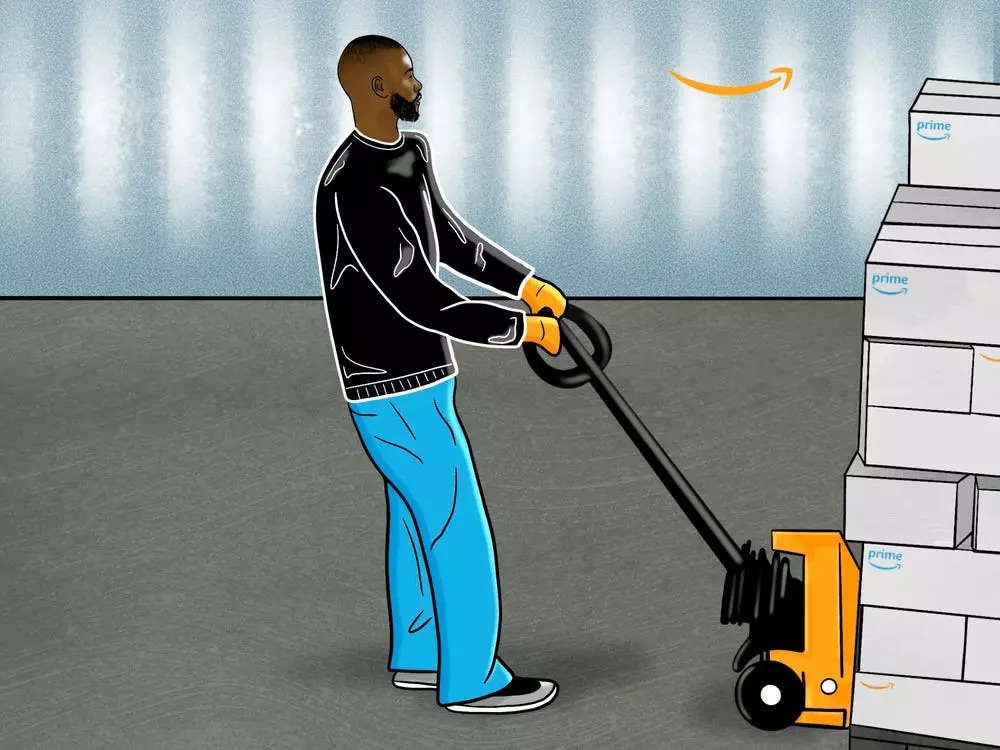
Behind the project:
One of the biggest challenges we face as developers is how to seamlessly incorporate text, data visualizations, photos, art, and interactive graphics to tell a story cohesively.
If I were to do this project over again I would adjust the visual hierarchy of design elements more. The story is very compelling, with great animations by Alonso Guzmán Barone, and shifting to a more striking design that gives more weight to the animations would allow them to lead the story more.
- Taylor Tyson, Associate Data Graphics Developer
Maps show the territory Ukraine has taken back after Russia's invasion
Design and development by Shayanne Gal
1,133 people who work for the Queen
Design and development by Skye Gould, Sawyer Click, and Taylor Tyson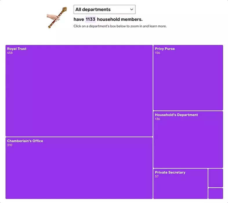
A Refugee's Journey
Design and development by Shayanne Gal and Kazi AwalSociety of Illustrators 65 Silver Medal Winner for Editorial Series
Behind the project:
The most challenging part of the conception and design of this project was determining how to present the complicated refugee resettlement process, which involves a lot of bureaucratic jargon and details, as a compelling visual narrative to our readers, while still shedding a light on the humanitarian importance of the refugee crisis. Combining illustrations from the very talented Tara Anand with our data graphics helped humanize the experience.
It was imperative to me that we kept the refugee experience at the forefront of the story, while still integrating the critical information and resources that would be useful for all of our readers, including prospective refugees who may be resettled in the US in the future.
- Shayanne Gal, Senior Data Graphics DesignerInside the Post-Roe Future
Design and development by Taylor Tyson, Annie Fu, Jenny Chang-Rodriguez and Skye Gould
Behind the wave of state abortion bans, there are a lot of men
Design and development by Taylor Tyson and Annie Fu
7 maps and charts that show what could happen now that Roe v. Wade has been overturned
Design and development by Shayanne Gal and Taylor Tyson
America's lost Chinatowns
Design and development by Annie Fu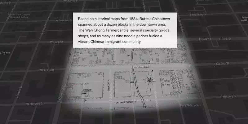
Behind the project:
This story marked our first time building a scrollytelling map to highlight multiple geographical features in one city, as well as their proximity to each other.
Using Mapbox, this story takes a look at two different cities and overlays historical maps from each to illustrate where historical Chinatowns used to stand compared to where they are now. The maps not only provided visual detail to each of the examples in the story, but also contributed to the overall narrative that there are dozens of similar stories for Chinatowns across the US.
- Annie Fu, Associate Data Graphics DeveloperHere are the hedge funds that billionaire founders trust to manage their families' foundations
Design and development by Taylor Tyson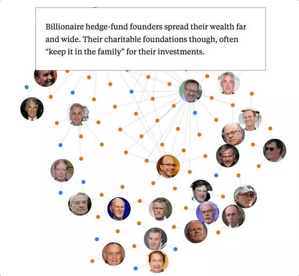
Deaths in the Family: Investigation of 175 transgender homicides over 5 years
Design and development by Kazi Awal, Shayanne Gal, and Skye GouldWinner of the Hillman Foundation Sydney Award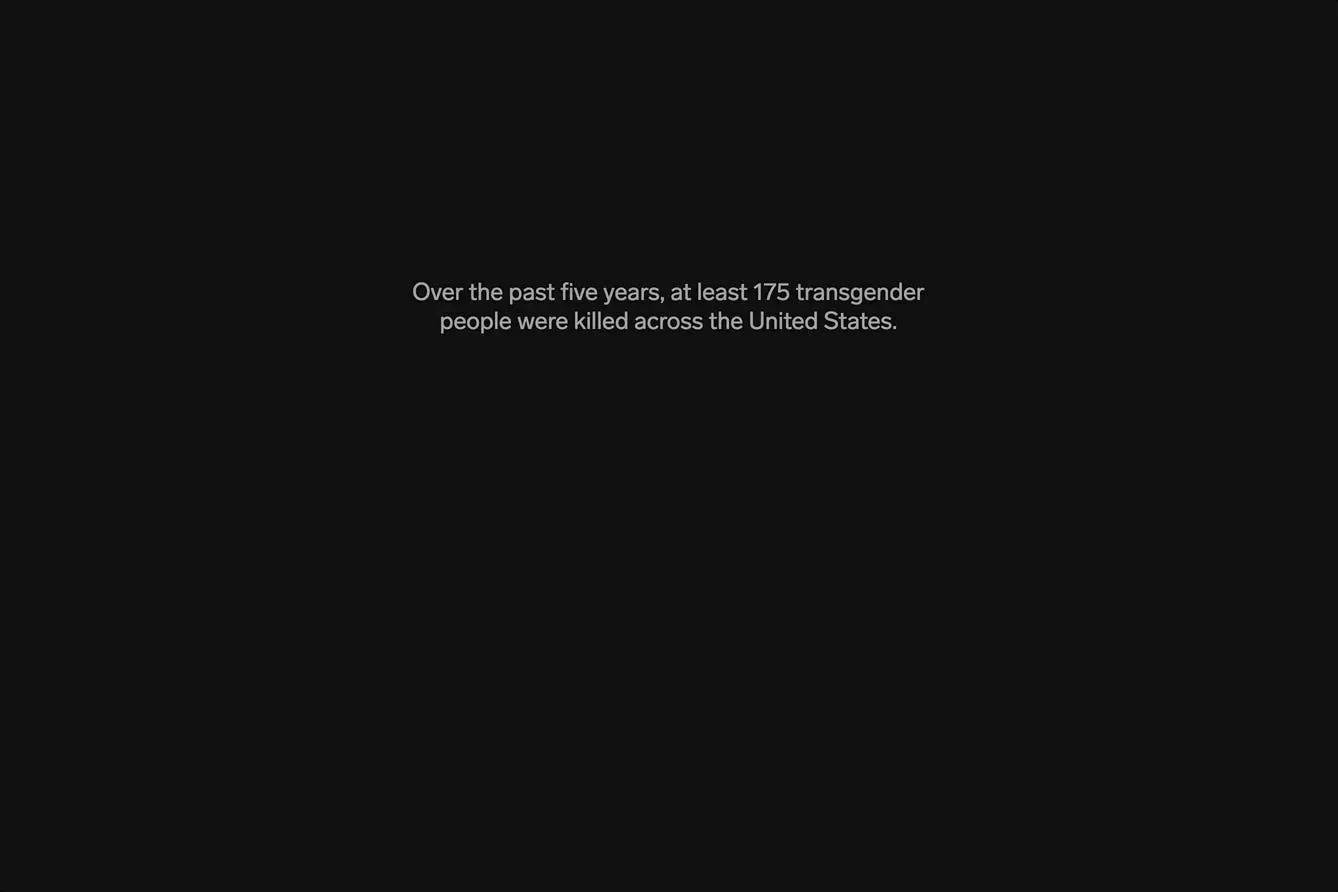
Behind the project:
The main challenge of this project was designing an impactful introduction to the story that felt respectful to the subject matter. It was important for us to give a sense of the numbers without losing the humanity behind them. The work was mostly editing, editing, and more editing alongside our various stakeholders.
Are there enough data points at the top or too many? Are they the right ones? Are we representing the findings fairly? These are just some of the questions we tried to answer through our many iterations, in addition to the usual visual and interaction design concerns we are always keeping top of mind for our users.
Ultimately this challenging but thoughtful collaboration led us to the final experience that garnered us a lot of positive feedback from the community.
- Kazi Awal, Senior Creative DeveloperOn the Tesla production line: Dozens of former employees say they faced catcalls, groping, slurs, and harassment on the job
Design and development by Taylor Tyson
Nike CEO's first 2 years have sent its stock soaring, but insiders worry about a talent exodus
Design and development by Taylor Tyson
Sports betting's rise in the US has created a startup boom
Design and development by Taylor Tyson, Annie Fu, Shayanne Gal, and Alex Ford