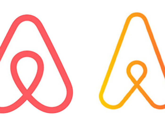
Airbnb's logo wasn't all that original in the first place. When the logo first appeared, many were quick to compare it to genitals, with Gizmodo calling it a "sexual Rorschach test." Others, though, noted that the logo resembled that of Automation Anywhere, which released its logo around the same time in 2014.
Both companies were quick to settle the issue.
As an Airbnb spokesman told the BBC: "Airbnb and Automation Anywhere are working cooperatively to address this issue, and Automation Anywhere is in the process of transitioning to a new logo design that is not similar to the Airbnb logo."
It's a tale as old as time — or at least the 1970s. NBC rolled out a new logo in 1976, trumpeting its million-dollar design.
After plastering it everywhere from promos to blazers, the broadcaster got a call from a Nebraska network that pointed out the similarities between their logos. ETV filed a suit immediately, as the logos only had a couple of different color choices to distinguish the two.
NBC ended up settling the case, going on to quickly create yet another logo, which also wouldn't be their last. The company eventually returned to its classic peacock-based designs and has not deviated since.

When you try to do something no one has done before, you usually realize that it's all been done before. Originally describing its logo as "fresh, inviting, and open," software developer Quark was forced to backpedal and apologize after the Scottish Arts Council responded to its "new" design.
"We are very proud of our logo which the design company first presented to us on 7 February 2001," a spokesman for the council said in 2005 after the Quark design was released. "Our logo was intensively researched, and then trademarked and launched in 2002."
While the council still uses its blue-styled logo, Quark quickly moved onto a newer, more colorful logo.

As ETV showed, David still can defeat Goliath, and Korean chain Elpreya struck a similar blow to coffee giant Starbucks.
Both coffee companies opened their first stores in Korea in 1999, and Starbucks acted swiftly to try and strike down its competitor, which operates under the name Starpreya. Korean courts ruled in favor of the native company, mainly because outside of America, Starbucks wasn't well known.
Starbucks didn't give up, though: It continued to appeal until 2007, when the final appeal was struck down. Starpreya was allowed to continue using its nearly decade-old logo.

Few can take on the Mouse and walk away, but that's exactly what DJ Joel Zimmerman, better known as Deadmau5, did.
As a Canadian, Deadmau5 had no problem setting up his look back home. But when he tried to register the shape of his headwear in America, Disney filed a suit, claiming the look was "nearly identical in appearance, connotation, and overall commercial impression to Disney's Mouse Ears Marks."
Deadmau5 took to Twitter to defend himself, saying "Lawyer up Mickey," and that "Disney thinks you might confuse an established electronic musician/performer with a cartoon mouse."
By 2015, though, Disney and Deadmau5 settled, and Disney withdrew its complaint.

After Liberty Media bought Formula 1 for $4.4 billion in 2016, it decided to make some changes. For 23 years, the racing organization used the same logo, so the American investment firm decided to give it a new spin.
The result, introduced in November 2017, was met with a lukewarm reception. Racers commented that it was an iconic logo and didn't see the need to change it. American conglomerate 3M, best known for Post-Its and Scotch tape, also didn't see the need to change — especially since the new logo looked remarkably similar to that of its Futuro line of braces and supports.
3M lodged its complaint in the summer of 2018, and the case is still ongoing. F1 continues to use its new logo.

Sometimes, it's best to ignore your first impression. If he had gone with his gut, Barack Obama might not have ended up rolling out the logo and slogan that came to be associated with his 2008 campaign for president.
Obama apparently thought that "Yes We Can" was too simplistic to be effective, and when he first saw the now-famous logo for his first presidential bid, he said, "The logo I thought was a loser. It looked like the Pepsi logo, and I thought, 'That seems a little corporate to me.'"
Luckily for him, he was convinced to stay with it. In the words of chief strategist David Axelrod, the logo ended up "more iconic than the Apple insignia."
 In second consecutive week of decline, forex kitty drops $2.28 bn to $640.33 bn
 SBI Life Q4 profit rises 4% to ₹811 crore
 IMD predicts severe heatwave conditions over East, South Peninsular India for next five days

Copyright © 2024. Times Internet Limited. All rights reserved.For reprint rights. Times Syndication Service.