An alarming thermal map of the coronavirus outbreak predicts how the infection could spread
Mar 12, 2020, 17:51 IST
- A thermal map of how the coronavirus spread over the last couple of months shows a correlation between temperature and infection.
- According to the study, Covid 19 failed to spread significantly to countries immediately south of China.
- Large cities like London, New York and Berlin are tentative areas at risk in the short run.
- However, the study does not take other variables like human intervention, travel and climate change into account.
Advertisement
A new map shows how the coronavirus pandemic could be headed to cooler temperatures putting cities like New York, London and Berlin at risk. Tracking the virus outbreak so far, scientists believe that Covid-19 is more comfortable in cold and humid environments.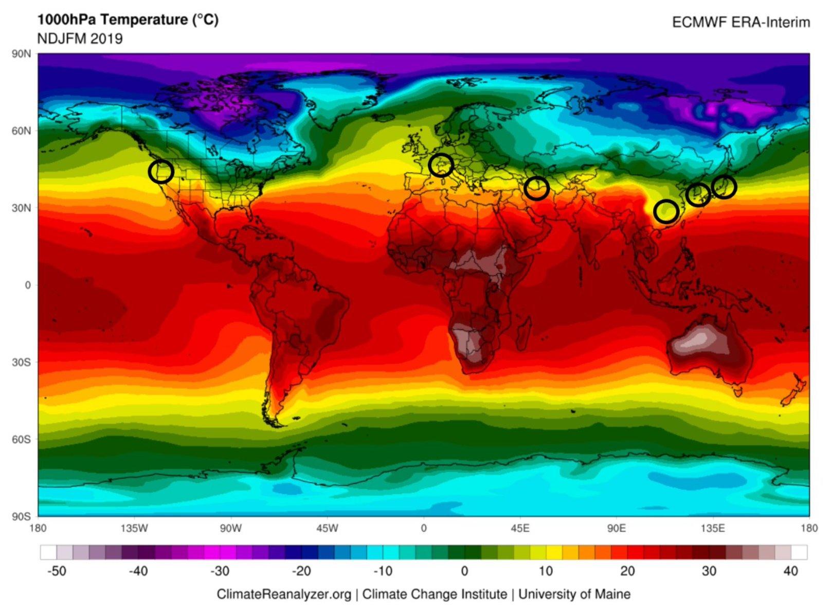
However, critics believe that the theory doesn’t hold water. AIIMS Director Randeep Guleria told ET that humidity — and air, in general — help the virus grow but that doesn’t necessarily imply that any increase in temperature results in a reduction.
The study — led by Mohammad Sajadi at the Institute of Human Virology — acknowledges that there are many other factors that could impact how the virus spreads. Since so little is known, the authors believe that the association between temperature in the cities affected with Covid-19 deserves special attention.

It also points out that it’s not uncommon for infectious diseases to show a seasonal pattern as they spread. Influenza is a characteristic example of how a virus shows a significant fluctuation in temperate regions but less seasonality in more tropical areas.
Advertisement
The map is only a preliminary guide for a more comprehensive predictive model to be developed. It should be able to take into account climate, weather and their variations as well as play our simulations dictated by human interaction — like travel and population density.
What does the map show?
The map shows that the biggest coronavirus outbreaks have been where the temperatures are between five to 11 degrees Celcius and the humidity ranges between 47-79%. The region that fits those requirements is highlighted by the yellow band. Within the yellow band, are all the countries with the highest reported cases of the coronavirus.
It shows that the outbreak failed to spread significantly to countries immediately to the south of China. Furthermore, the number of patients and reported deaths in Southeast Asia were fewer in comparison to temperate regions in cooler climates.
“In addition to having similar average temperature, humidity, and latitude profiles, these locations also exhibit commonality in the timing of the outbreak coincides with a nadir [lowest temperatures] in the yearly temperature cycle,” the study explained.
Advertisement
However, since none of the affected cities so far have temperatures that dipped below freezing, it’s possible that the coronavirus is also susceptible to a minimum range.“All of these point to a potential direct relationship between temperature and SARS-CoV-2 environmental survival and spreading,” says the study.
Where is the coronavirus headed next?
Given how the coronavirus outbreak has spread so far, the study believes that cities in the Northern Hemisphere — including like London, Berlin and New York — are at high risk going forward.
According to the map, tentative areas at risk in the near-term include those next to light green bands.
It should be noted that the study does not take climate variables like cloud cover into account. It also does not take human factors like intervention and travel into consideration as well as any mutations that the virus may undergo during the period.
Advertisement
“Although the current correlations with latitude and temperature seem strong, direct causation has not been proven and predictions in the near term are speculative and have to be considered with extreme caution,” says the study.
| Large cities tentatively predicted to be at risk in the coming weeks: |
| London |
| Manchester |
| Berlin |
| Prague |
| Hamburg |
| Vancouver |
| New York |
| Warsaw |
| Glasgow |
| Kiev |
| St. Louis |
| Beijing |
See also:
Coronavirus in India: Airports are spraying sanitizer, calling in doctors, and screening international passengers to keep the outbreak under control
Coronavirus travel ban: India on lockdown till April 15
Coronavirus recovery rate at 54% as doctors race to find a cure
Coronavirus latest news and updates