

Researchers found that descriptive logos make money.

The original study, which was published in the Journal of Marketing Research, examined 597 logo designs with the help of 2,000 participants.
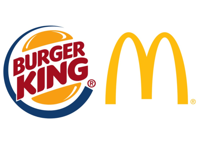
The logos were split into two categories. The first, descriptive logos, denote what a company does through its imagery. For example, the Burger King logo is shaped like a hamburger. The second category, non-descriptive logos, are more abstract in nature, like the McDonald's logo, which makes no reference to fast food.
The researchers, who were marketing professors from Canada, England, and France, found that 60% of major companies use a non-descriptive logo, while 40% use a descriptive logo.
Participants were given descriptions of various companies and then evaluated logos on their authenticity and likability, and they gave higher ratings to the descriptive logos in every category.
Non-descriptive logos are seen as less authentic.
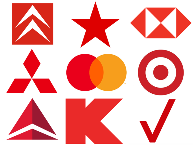
Non-descriptive logos typically give no hint as to what services or products a company buys. Participants in the study found logos like this less trustworthy and authentic, even if they were given a description of what the company does.
Familiar brands aren't as affected by their logos, according to the study. Companies with widely recognized logos, like the McDonald's golden arches, no longer need to rely on new consumers to identify with their brand, because they're already widely known.
Unfamiliar brands, however, need their logos to communicate what they do for consumers. A logo with an abstract symbol, like a red star or an arrow, is usually too subtle for consumers to identify with.
Descriptive logos are easier to identify with.
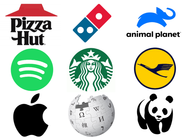
Descriptive logos are typically clearer in their message. Consumers can guess that the World Wildlife Fund's panda logo has something to do with animals. This is true even for more abstract descriptive logos. Spotify's logo, with is three curved stripes, denotes sound waves. Suddenly it makes sense when a consumer learns it's a music streaming service.
Even logos that reference a company's name, as opposed to its function, are descriptive, like Apple's logo. With a concrete image, consumers have a better idea of that company's brand.
Understanding a company's brand could mean customers are more likely to buy from it. That's why, the researchers argue, descriptiveness makes a logo feel more authentic, and people are in turn more inclined to buy.
According to the study, "logo descriptiveness can positively affect impressions of authenticity and, in turn, purchase intentions."
The study also looked at the profitability of these companies, and found that there was a "significant positive association between logo descriptiveness and gross profit."
To do this, the researchers used control variables like symmetry, color, and shape to account for differences in logos, then compared net sales.
The only negative side of descriptive logos, say the researchers, is when the company in question deals with unappealing products or services, like a funeral home or bug repellent.
If fledgling companies want to be successful, say the researchers, they should think deeply about their logos. While it may be a cliché, including a book in your bookstore's logo could help business — especially if you do it in a unique, creative way. But if you're creating a company with several unrelated ventures, like the next Uber or Disney, don't be too concerned with adding cartoon cars or Mickey Mouse.


