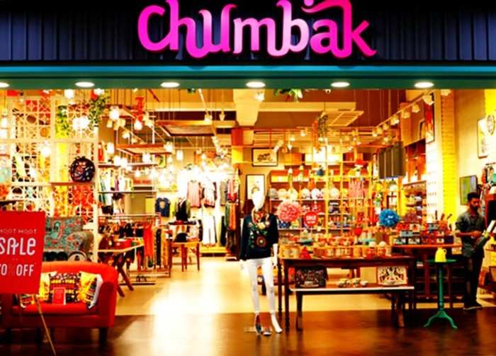
Chumbak Store
The new logo aims to reaffirm Chumbak’s positioning as a lifestyle brand.
Jul 10, 2020, 19:28 IST
brands
Chumbak has changed its logo and we miss its earlier style and colour
Jul 10, 2020, 19:28 IST
The new logo aims to reaffirm Chumbak’s positioning as a lifestyle brand.
Chumbak changes itsbrand identity .- Its
new logo is designed to work effortlessly across the brand’s digital and physical channels.
Here is what the new logo looks like:

As per the company statement, the new logo is designed to work effortlessly across the brand’s digital and physical channels. It uses a simple serif typography that mirrors the brand pillars of wit, warmth and authenticity. It also brings to the forefront, the beloved Chumbak owl that is known and recognised by its growing community of consumers and community. The design was developed with the in-house brand team and Delhi-based design consultancy, Bull Design. The logo will be rolled out across brand touchpoints in the months to come.
The new logo aims to reaffirm Chumbak’s positioning as a lifestyle brand. Speaking of which
Vasant Nangia, CEO of Chumbak, added, “In the last ten years, Chumbak has successfully diversified its product portfolio and scaled to appeal to audiences across the country. The new brand identity reflects our mission to be an evolved and globally relevant, design-led lifestyle brand.”
Chumbak was founded in 2010 by
INSIDER INTELLIGENCE REPORTS


